723x800 |
640x708 |
108x120 |
75x75
 Mike Sibley
Comment
Posted Oct.6th, 2013, viewed 60 times
Mike Sibley
Comment
Posted Oct.6th, 2013, viewed 60 times
EXERCISE 3
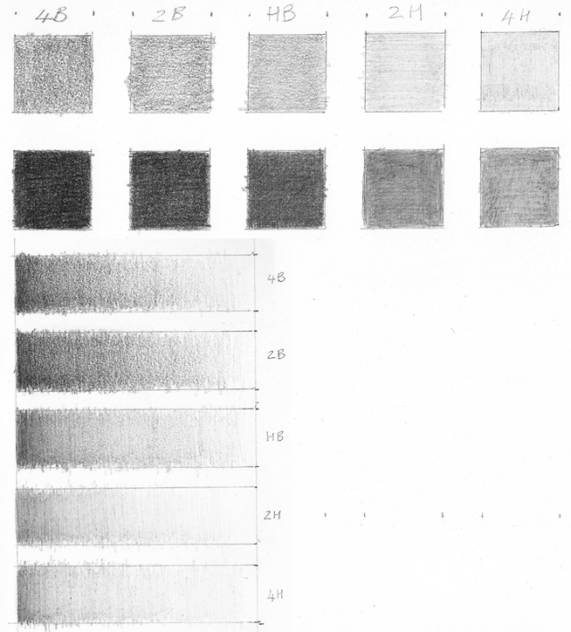
Good regular shading - lovely and smooth. And I'm pleased to see you going darker in the second row of boxes, although the 4B and 2B in particular could be darker.
The 4B and 2B in particular need to be as black as you can make them, because the greater the difference between your darkest tone and lightest (the white of your paper), the greater will be the range of tones available to you in your drawing. And good solid blacks will add impact to your drawings and help with three-dimensional rendering.
Part of the problem with your blacks is that your shading is not solid. Where your eye will generalise and see a "black" as black, computer monitors show you what is really there - and in this case it's a lot of white content. Those flecks and dots of white will visually dilute the strength of the blacks you are trying to achieve. As far as I can tell, you've shaded in one direction only. If you now shade again but vertically, you will fill in most of the white holes. You can even shade diagonally too if you think it will help you. The more directions you can approach those holes, the better and more evenly you will fill them. If you shade using tight circles, you'll fill almost all of them. In time you'll find the technique that works best for you.
Judging from the ends of your lines of shading, I think you might be using the side of the pencil? To create really strong blacks, try holding your pencil more vertically (you can apply more pressure without breaking the point) and use the point itself for your shading. The point will more easily fill the tooth of your paper and minimise those white specks.
EXERCISE 4
Again, you've produced lovely smooth gradations through the tones, although your blacks are much weaker than you achieved in exercise 3.
If you squint at your boxes you should see that the darkest tone of your bottom box can be matched almost all the way up to 4B. So most pencils can produce many of the tones that the other grades can. Notice also that the harder grades produce a much smoother finish. That's because the harder leads contain a greater ratio of finely-ground clay to graphite.
You can use that to your advantage. For example, you could use a grainier soft grade for drawing a dirt floor, or a harder smooth grade for drawing a shiny metal flask. The tones might be the same, but the perceived surface texture is completely different.
In response to comment:
Community Critique
This work has not yet received a critique from members of the Drawspace community. Check back soon!