870x720 |
640x530 |
120x99 |
75x75
 Mike Sibley
Comment
Posted Dec.3rd, 2015, viewed 140 times
Mike Sibley
Comment
Posted Dec.3rd, 2015, viewed 140 times
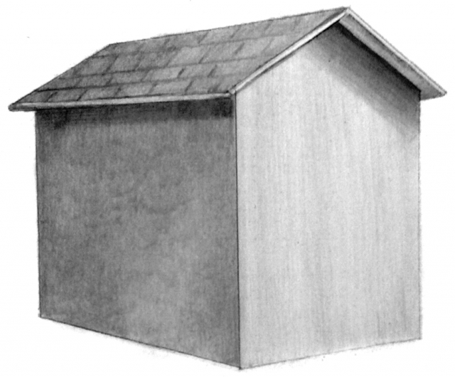
EXERCISE 4
First, I'm critiquing a greyscale copy of this so I can appreciate your work more.
There are a couple of potential problems here, although I like the slightly rustic look of it.
THE ROOF:
This is perfectly shaded and good choice of tone, and its lower edge has a good sharp edge, which was necessary to divide it from the wall below. However, there is a problem - you've tiled it (good choice!) but the joints in your tiles don't follow the perspective of the roof. When you draw those lines, make sure they follow the angle of the nearest edge.
THE LEFT-HAND EAVE'S SHADOW:
This could have been darker, which would have emphasised the overhang of the roof, but it does its job as it is.
THE LEFT-HAND WALL:
Your shading is slightly patchy (shaded in circles but maybe in overlapping sections?)... but I like it! It adds interest to the surface texture and doesn't look at all out of place.
THE RIGHT-HAND EAVE'S CAST SHADOW:
This is excellent. It's solid and dark at the top and then gradually dilutes in strength as it travels lower. In this situation that's what we expect to see, because this is a relatively light wall, receiving some direct light, and that light will reflect back up into the shadow, diluting the strength of the lower edge and then progressively diluting it less as it approached the eave. Well done!
Incidentally, never mind what the reference might say. You need to interpret it in such a way that you're telling the viewer exactly what is going on. Which is what you have done.
THE LEFT-HAND WALL:
This is shaded vertically and looks perfectly OK. I'll mention here that if you had shaded it horizontally you have to follow the perspective. In this case, that's more applicable to the left-hand wall. If the lines don't follow the perspective they will look awkward and distract the viewer because they don't follow any expected pattern. The eye always looks for pattern and understanding and it's easy to unsettle it if you present it with something it can't match to it's known knowledge.
Finally, there is one other problem - you've relied extensively on outline. Line, as I'm fond of saying, plays no part in Nature. It's a purely man-made device that immediately destroys any sense of reality in a drawing. Always try to make the values themselves describe the edges. OK, that's something to bear in mind for future use - I know this was just an exercise in applying and blending tone :o)
Apart from that... this is actually very good!
In response to comment:
Community Critique
This work has not yet received a critique from members of the Drawspace community. Check back soon!