1011x500 |
640x317 |
120x59 |
75x75
 Mike Sibley
Comment
Posted May.14th, 2016, viewed 13 times
Mike Sibley
Comment
Posted May.14th, 2016, viewed 13 times
EXERCISE 3
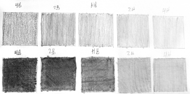
<< The dark values I achieved by doing vertical strokes, followed by horizontal strokes, followed by diagonal strokes trying to layer on the value and fill in the tooth of the paper. It's as dark as I can go. >>
You've achieved a good range of values but the shading is irregular - and you can go darker than that. Shading in multiple directions was a very good approach, but if you want to draw realistically your pencil lines shouldn't be visible. When they are, the viewer's eye will always detect it and their brain will simply label it a "drawing" instead of something to treated as real life.
I've adjusted your photo to what I believe (and Photoshop suggests) is closer to your original. Your bottom row 4B and 2B blacks appear to be quite dark but they suffer from inconsistent shading. Try working over those boxes again using as much pressure as your lead will stand (probably more than you think it will) with the aim of removing all the white and light content.
It's that white content that is severely reducing the impact of your blacks. Where your eye will generalise and see a "black" as black, computer monitors show you what is really there - and in this case it's a lot of white content. Those white holes and light patches will visually dilute the strength of the blacks you are trying to achieve, because your eye will read an average value.
As I said, shading in many directions is good practice,. Now try shading using small circles too, which will fill in any gaps and most of the white holes. The more directions you can approach those holes, the better and more evenly you will fill them. In time you'll find the technique that works best for you.
The 4B and 2B in particular need to be as black as you can manage, because the more contrast you can generate between your darkest value (tone) and lightest (the white of your paper), the greater will be the range of values available to you. And good solid blacks will add impact to your drawings and help with three-dimensional rendering.
Will you have another try please and post it back here. I'm not concerned with the harder grades, just the softer 4B and 2B. I'll show you a technique next week that will help you achieve solid darks. For now, do whatever you have to - even if it damages your paper. Knowing the limits is always useful.
Talking of damage: although I asked for the second row to be darker, don't try to draw too dark with the harder H grades from now on - you'll just indent or damage your paper. If you need a darker value at the hard end of the scale, move up to a softer grade. The technique that I'll show next week will help with that too.
In response to comment:
Community Critique
This work has not yet received a critique from members of the Drawspace community. Check back soon!