956x700 |
640x469 |
120x88 |
75x75
 Mike Sibley
Comment
Posted Oct.28th, 2016, viewed 83 times
Mike Sibley
Comment
Posted Oct.28th, 2016, viewed 83 times
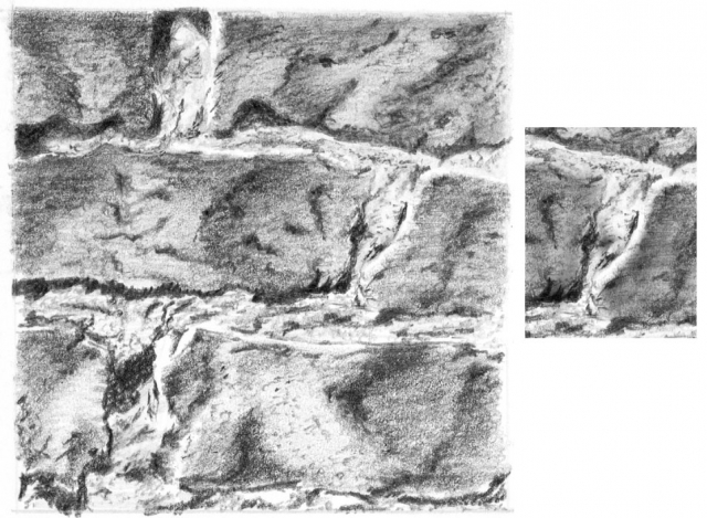
EXERCISE 1
A good result, Sandy. When I first saw it I thought it looked a little flat but I was pleasantly surprised when I'd adjusted your scan.
You've found different techniques for the mortar and bricks that definitely work. The textures translate well - I could run my fingers over both and feel the grittiness and sharp edges of the mortar, and the comparatively smoother bricks.
Did you layer the bricks with a hard grade to remove the white? There appears to be quite a lot remaining. Just a simple layer of 2H will kill the white and make your bricks look even more solid.
Leaving white within the mortar was a good choice, because the extra contrast obtained it is one of the things that makes it look different from the bricks. Your dark shadows beneath the bricks give excellent depth, as well as reinforcing the sharpness of the edges, but I think the three-dimensional modelling in the mortar could be more clearly stated.
I've had a quick go on one bulge in the mortar, and I dulled the white in the bricks too. Fix the lighting direction in your mind and then apply it to everything as you draw. That should help you to think about everything three-dimensionally. The shadows will suggest themselves and you'll create a more understandable image. That's one of the benefits of working only on a small area at a time - you have time to consider it as if it was real - how light affects it and how it will affect anything around it - and you'll create a strong sense of reality.
Well done!
In response to comment:
Community Critique
This work has not yet received a critique from members of the Drawspace community. Check back soon!