1137x700 |
640x394 |
120x74 |
75x75
 Mike Sibley
Comment
Posted May.15th, 2018, viewed 36 times
Mike Sibley
Comment
Posted May.15th, 2018, viewed 36 times
<< bricks of my own imagination. I used HB for the bricks with some light blending to attempt to convey a smooth surface, and 2H for the mortar. Some 2B was applied to the darkest shadows. >>
I'm going to concentrate on one area at the top right. First all your bricks have a lovely solid feel about them. That's partly because you've removed any white content. That simple step makes such a huge difference, yet it's not easy to explain.
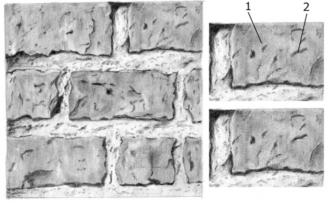
You have one hole (1) that has a very subtle highlight above it. That tells me the brick surface is slightly bulging forwards above the hole. Other holes elsewhere are not as successful. That's because they involve no highlights at all. Omit the highlight and a hole becomes a mark on the surface - which is fine if that's what you intended.
Hole 2 is such a hole. I'm fairly certain it is a hole but nothing is reinforcing that impression. It too could just be a dark surface flaw. Add a highlight - see my alteration below, where I darkened the hole for clarity. It need only be very thin and subtle, but that highlight means it can only be a hole. A hole will catch the light on the edge facing it. It's what I call a "visual clue". It's something we instinctively understand. If an edge has a highlight, the dark area MUST be a hole. There is no other possible interpretation.
<< I am realizing one of the most challenging things for me is the accurate understanding and depiction of light and shadows. I have google a number of resources to try to learn a bit more about how shadows fall, but still struggling to make the connection. >>
Shadows, in particular, are very powerful tools. In the Advanced course we spend an entire week working with them, and understanding the science behind them. way they form. The problem is, we instinctively understand shadows so we very rarely look at them, or study them.
I can see from your drawing that you had a very good idea of the textures and forms of your bricks. Decide on your lighting direction, and keep the three-dimensional forms in mind at all times. And spatial relationships. If the bricks stand proud of the mortar, as yours do, then logically the bricks will cast a shadow on the mortar. There might also be a few holes in the mortar, if its old, between it and the brick. You need to find a way of describing the hole in a different way from the shadow, so they are clearly not the same.
The bricks I find too busy. That's just personal preference. Too many holes and features distracts from the overall drawing.
The mortar is perhaps the weakest part of the drawing. The most convincing area (to me) is central in the top row. It has the makings of a gritty surface and, more importantly, it has good form. I can feel that edge under my fingers. And the cast shadow reinforces that it is a protruding edge. As you progressed down the drawing, I think you had less and less of a mental picture of what you were drawing, so it looks rather flat and smooth.
It looks as though you were making marks that represented something that then weren't developed. I think of drawing as sculpting. Use the light and shade to tell me, the viewer, what you had in mind. You've left quite a few blank spaces that look like large highlights. Every highlight needs a reason to be there. A highlight is created when the surface protrudes or bends to face the light. If its protruding, it has to protrude from somewhere, and that somewhere will probably be in the shade. When I'm working, I think of it this way: If I press harder I'm "pushing that area back" and my shading, due to the pressure, increases in darkness. If I "feel" a bump coming forwards, I "allow" it to push my pencil up, which causes it to draw more lightly. It's a form of sculpting where the surface is controlling my pencil, and I'm constantly reminded of its three-dimensional nature.
Finally, you found two different drawing methods to depict the two surfaces, and that was an ideal choice. Another was leaving some white in the mortar. Again, that makes it not look like the brick. And I'd argue you can legitimately leave white, because the quartz grains in the sandy mortar mix will reflect light. Personally, I use flat shading for the bricks, as you have done, and use stippling for the mortar to emphasise its grainy texture. The stippling then has a layer of 2H applied wherever I want to remove pure white. It's not the only way - your way looks good too - it's just my way :o)
In response to comment:
Community Critique
This work has not yet received a critique from members of the Drawspace community. Check back soon!