886x800 |
640x578 |
120x108 |
75x75
 Mike Sibley
Comment
Posted Jan.28th, 2020, viewed 7 times
Mike Sibley
Comment
Posted Jan.28th, 2020, viewed 7 times
Unfortunately, because you've placed all four exercises into the same post, my response is quite limited. So, I'll tackle EXERCISE 1 here and then each of the others as separate comments.
EXERCISE 1
This has sort of worked but not as well as it could have done. BUT this might be one technique that works for me but not you. And, in time, you'll develop some that don't work for me :)
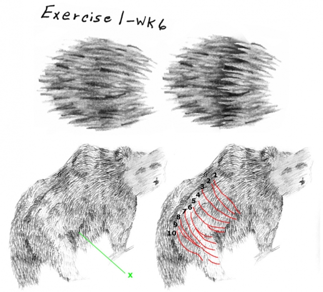
You've not formed any sharp, v-shaped ends that might represent hairs, and no sense of the hair being in overlapping layers. I feel you were concentrating too much on the marks and not enough on the gaps, and it's the gaps - the voids created by the Vs - that are important.
Being able to split detail from three-dimensional form can often help you produce more realistic drawing, and it makes life easier and more manageable. Trying to handle both together can be quite a problem at times, especially in small scale drawings or distant subjects.
This should help: DIVIDE LINE AND TONE
If we don't make mistakes, we don't learn. I even design some exercises to generate mistakes for that reason - although this isn't one of those :o)
What's missing in your hair is edges. Edges create layers. And layers cast shadows on the layers beneath them. I've separated out one layer on your drawing to show you what I mean.
Beneath is the work of an earlier artist on this course, and the edge marked X is very close to being ideal.
The body also contains other good edges, or portions of them. But I'm using this opportunity to lay out a plan. My red lines represent layers and their order. They are not necessarily correctly positioned - if they were, they might be too close to see in this case.
Imagine drawing the LINE content only - that's the edges and/or detail. You only have to concentrate on where the locks would be and their shape. Work along row 1. On completion, begin again and create row 2. Then keep inventing those locks down all the other edges up to row 10.
Now go back to row 1 and create the shade between the locks, and fade it into row 2, so row 2 appears to be emerging from beneath row 1. At this stage, leave the ends of the locks white.
When row 10 is complete, look at the Global shaping. If the side of the bear picks up highlights along the top, the locks will be light. Further down its side they become darker. Apply a layer of shading over the whole area that tones down the white at the top and gradually darkens it as you progress to the bottom. Now you can concentrate only on the three-dimensional form, without having to think about the actual locks at all.
There are no rules. In practice, I might create Row 1 and 2 and decide to create the stage 2 local shading before moving onto row 3. Or I might create 5 or 6 rows, go back, create the local shading.... etc It's flexible. Just shade when you feel the need. If fully completing, say, the first 6 rows will help with inventing rows 7 to 10 - complete them.
But, essentially, you're making life much simpler for yourself.
Stage 1: The Vs create the locks along each row/layer.
Stage 2: you add some reality and depth by adding the localised shading - the way one layer casts shadows on the row below it. Because you've drawing a LOCK and not a BEAR, you can be very precise. You might, for example, decide to make one lock more noticeable by giving it a darker cast shadow, or another area might be allowed to lay almost flat to the layer below. It gives you that level of control.
Stage 3: You add the overall, global, three-dimensional shading.
This is my core way of working. Bear hair, foliage, a dog's ear, a bale of straw, a ball of wool... doesn't matter what. I design the foreground with line (the Vs in this case). Then I work background to foreground, so the foreground is pushed forwards. Finally, the detail is added to the foreground layer or, in this case (because it's a small drawing) the foreground layer displays the overall three-dimensional shaping. The more you break a drawing down, the easier it becomes, and the more sense of reality you can build into it. I say "sense" of reality, because you're really suggesting it, not necessarily creating it with tight detail. In fact, tight detail in the background and midground often defeats the purpose - it can swamp the foreground, attract too much attention, and you lose all the depth.
In response to comment:
Community Critique
This work has not yet received a critique from members of the Drawspace community. Check back soon!