954x700 |
640x470 |
120x88 |
75x75
 Mike Sibley
Comment
Posted Jan.28th, 2020, viewed 8 times
Mike Sibley
Comment
Posted Jan.28th, 2020, viewed 8 times
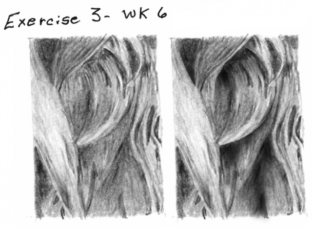
EXERCISE 3
This is frustratingly close to being good.
First, you gave yourself a major problem as soon as you established the first dark area of shade. All the dark areas are very weak and full of light patches. From that point onward you forced yourself to work with a restricted palette of greys. And as your highlights are mainly midtone (you could have left them almost white) you've closed down the range of available values from the other end too.
I can see you can understand this three-dimensionally and the shadows and shaping mainly work well. But many of your edges are soft and woolly, and your midtone shading is similar to your darks, grainy and full of holes. That might be your paper that is causing that, but you could have overcome it by using a harder grade. This gives the impression of lightly applied soft grades throughout. Harder grades (HB, 2H) would have given a much smoother appearance. As it is, the result is an unintentional and unnatural rough texture that fights with expectation of a smooth flow of hair.
All that's needed to turn this into a really believable drawing is stronger darks, smoother midtones, and attention to detail. And with that goes the constant mental reminder of what you are actually drawing. You just need to go a level or deeper into whatever you are describing.
I've had a go at altering a couple of areas of your drawing. Every time you invent a lock it has to be coming from somewhere and going somewhere, and it has to interact with any locks around it.
In response to comment:
Community Critique
This work has not yet received a critique from members of the Drawspace community. Check back soon!